ActivateStaff Staffing Dashboard
MY ROLE: Conceptualization, Design, Usability testing, Dev hand-off, Marketing assets
BACKGROUND
Staffing agencies need to keep jobs staffed and workers employed. Their success as an agency quite literally comes down to their ability to fill jobs and how quickly they can do it; to keep employers fully staffed and workers working. A recruiter’s workday revolves around a core question: “what jobs do I need to fill today?”
The ActivateStaff platform is an all-in-one solution for staffing agencies, so we were concerned with every step of the recruitment process. From on-boarding new workers to the platform via the mobile app, to creating jobs and work schedules in the agency portal, to placing workers in suitable jobs, the platform did it all, and our dashboard needed to be the hub through which the entire process could be accessed.
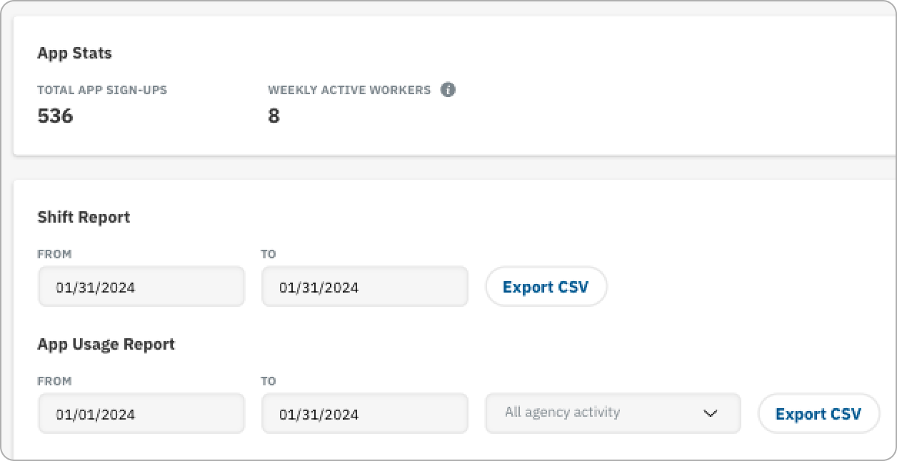
Prior to this project, our dashboard was mainly a hub for downloading reports, along with some miscellaneous activity feeds. The reports were useful, but the dashboard had so much more potential.
Refreshing the dashboard became an important part of our product roadmap, so our Product Team hopped on it and began doing some research.
Through interviews with recruiters and account managers at staffing agencies, we validated a core pain point: Users lacked a fast, centralized way to see which jobs needed to be filled urgently.
This meant agencies were slower to respond to clients, less competitive, and at a higher risk of losing business to agencies who could fill jobs faster. The metric our users focused on the most was job fill speed - this was one of the clearest opportunities for improving our dashboard.
Users wanted fewer steps, fewer pages, and more visibility. We learned that the fastest way to improve job fill speed was to:
Surface open placements to the top of the dashboard
Make everything clickable
Reduce the path between “I need to fill this job” and “I’ve invited candidates.”
We learned that filling open placements was usually a fire that needed putting out ASAP and a staffing agency’s ability to put it out was their entire value proposition. So our platform needed to help them do that, and we needed to start at the dashboard.
ITERATIONS
After our preliminary research, our Product Team began testing some concepts for a new dashboard. We started by asking open-ended questions and testing broad concepts related to potential solutions we sketched up as a team. Some of our early lo-fi mockups were too busy and didn’t allow clients to quickly identify the most useful information: “what jobs do I need to fill today?”
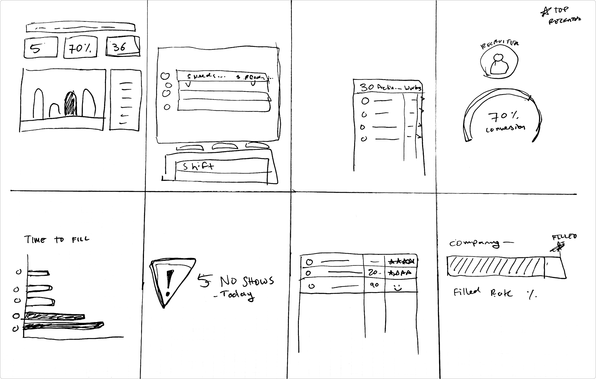
At the start of the dashboard redesign, our Product Team worked through a Crazy 8s ideation exercise with the product design team to encourage divergent thinking and alignment on priorities.
Each designer rapidly sketched six distinct dashboard concepts, spending approximately three minutes per concept, based on what we individually believed were the most critical components and information hierarchy for users.
Through time-boxed sketching and group critique, we aligned on key user priorities, information hierarchy, and feature importance early in the design process, setting a clear direction for subsequent wireframing and iteration.
As we worked through iterations, we faced a fundamental design dilemma: how much customization should we give users of the dashboard? I’ve seen and used so many different dashboards, and answering this question ultimately depended on who the end user was. Some users are extremely savvy and are concerned with very technical metrics and so giving them the freedom to manuever metrics around their dashboard so they can focus on their niche metrics works very well.
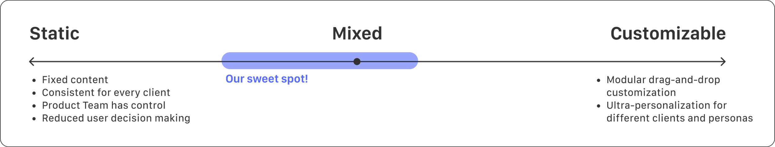
The users of our dashboard were business oriented recruiters who were laser focused on getting jobs filled and minimizing job no-shows. Our research and interviews with them validated that and allowed us to curate a dashboard that reflects their priorities.
Understanding the priorities of our users was a fundamental requirement for building a truly useful feature. It was only through an iterative process with our users were we able to really understand their daily workflows so we can find our place within them.
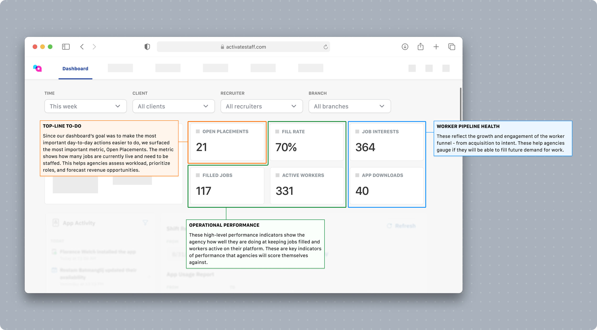
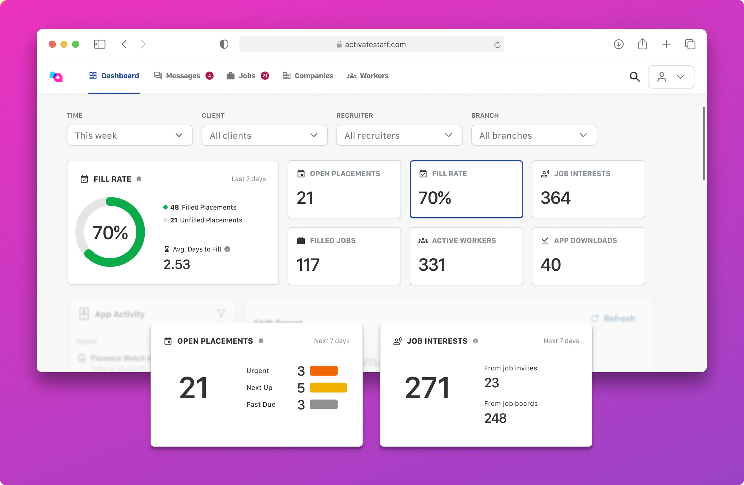
These were the priorities. First, in the effort to make this a actionable landing page for users when they login, Open Placements were displayed right at the top; these were the most urgent to-dos of the day. From the dashboard, a user can immediately jump into a real-time list of all unfilled jobs, without navigating through menus.
Next, to keep a pulse on operational performance, indicators of Fill Rate, Filled Jobs, and Active Workers are displayed for the agency to know how well they are keeping jobs filled and workers active on their platform. Finally, to make sure their pipeline of workers remained steady, indicators of Job Interest and App Downloads.
We inevitably had to work through some complexities. One of the biggest differentiation between staffing agencies is the way they staff. Some staffing agencies staff workers by creating jobs, creating placements for those jobs with distinct start and end dates, then assigning workers to those placements, where those workers assume a schedule for the duration of their placement. Some other agencies skip the placements step and directly try to fill shifts on a schedule; nursing industry jobs largely use this model. Some agencies use both models. We needed to accommodate both without the data becoming confusing.
FINAL RESULT
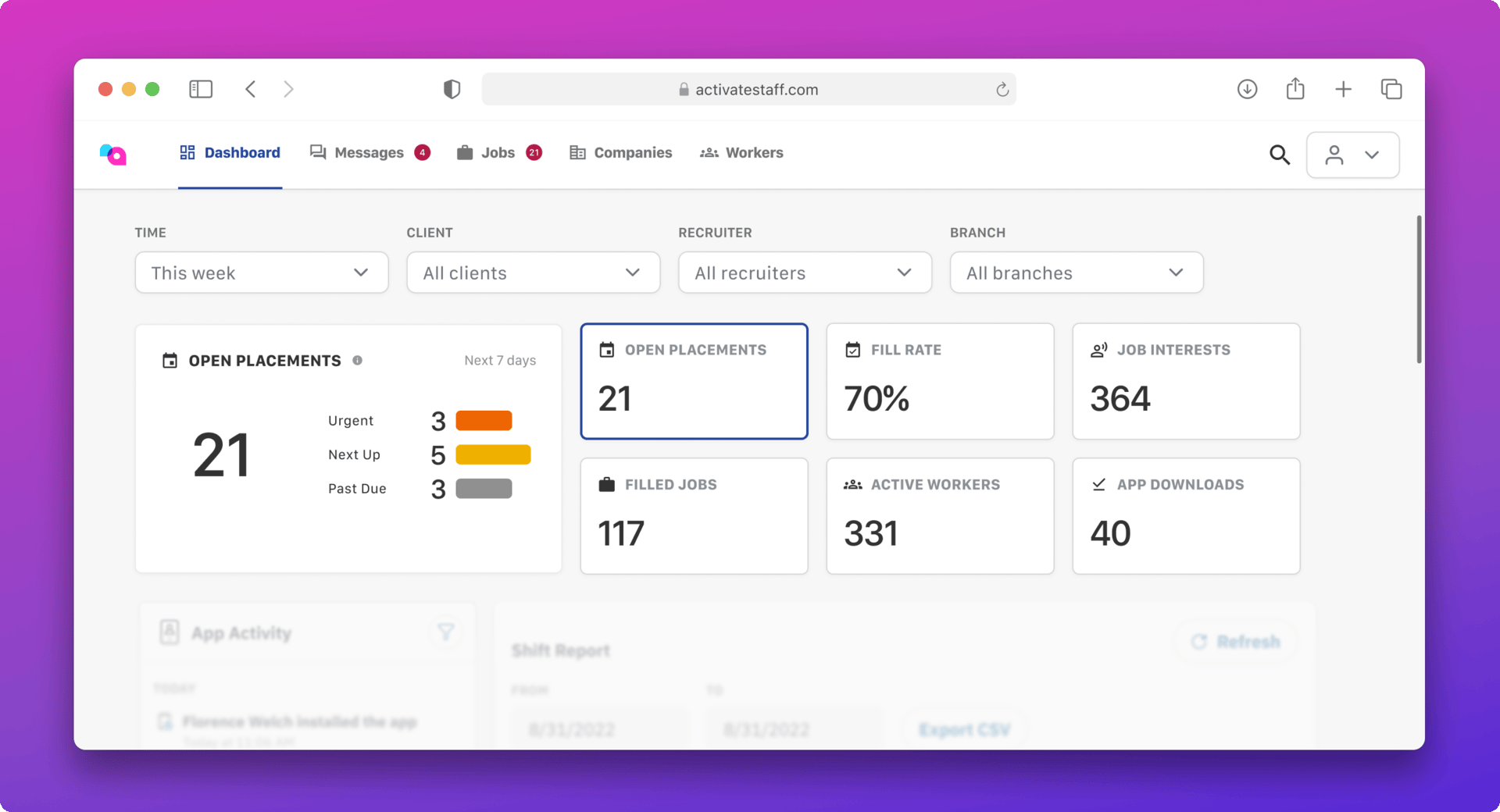
Through our iterative process, I drove the dashboard project to completion. We aligned on the key metrics and produced a dashboard that is a useful tool for our users. Recruiters can quickly see how many placements need to be filled for the coming week, broken down by most urgent, and be directed to an actionable screen upon clicking one the card. Users can get a pulse on their entire operations at a glance and be better equipped to make high-level decisions.